Loading...

Azure Quick Links

Azure Cloud Projects

Azure & Power BI Visualizations

Visualize SQL data with Pie and Map charts in Power BI to identify top-selling regions, countries, or sellers, and connect Power BI to Azure Log Analytics via the Kusto connector to display security alerts by severity using a Donut chart.

Task Details

1. Visualize your SQL database using a pie chart in Power BI.
Identify the best-selling regions, countries, or sellers, and customize the colors and fonts for improved visualization.

2. Visualize your SQL database using a map in Power BI.
Identify the best-selling regions, countries, or sellers, and adjust colors and fonts for a clear and engaging presentation.

3. Connect Power BI to Azure Log Analytics using the Kusto connector.
Use a donut chart to visualize the distribution of security alerts by severity level, providing a clear overview of alert categories and their impact.

Note: In this demo, I will use a sample SQL database for visualization.

*

Steps

Visualize your SQL database using a Pie Chart in Power BI

Use a Pie Chart in Power BI to visualize your SQL database and quickly identify top-selling regions, countries, or sellers with clear, customizable visuals.

Visualize you SQL database

1. Go to SQL database → Power platform → Power BI → Get started

*

2. Click on created .pbids file

*

3. You will be redirected to Power BI Desktop.

After authenticating to the Azure portal with your credentials, open the Navigator and select the tables you want to visualize.

Note: Before connecting, ensure your client IP address is added to the SQL Server firewall:

  • Go to SQL Server → Networking → Add your client IPv4 address → Save.

*

In this demo I will choose them all.

*

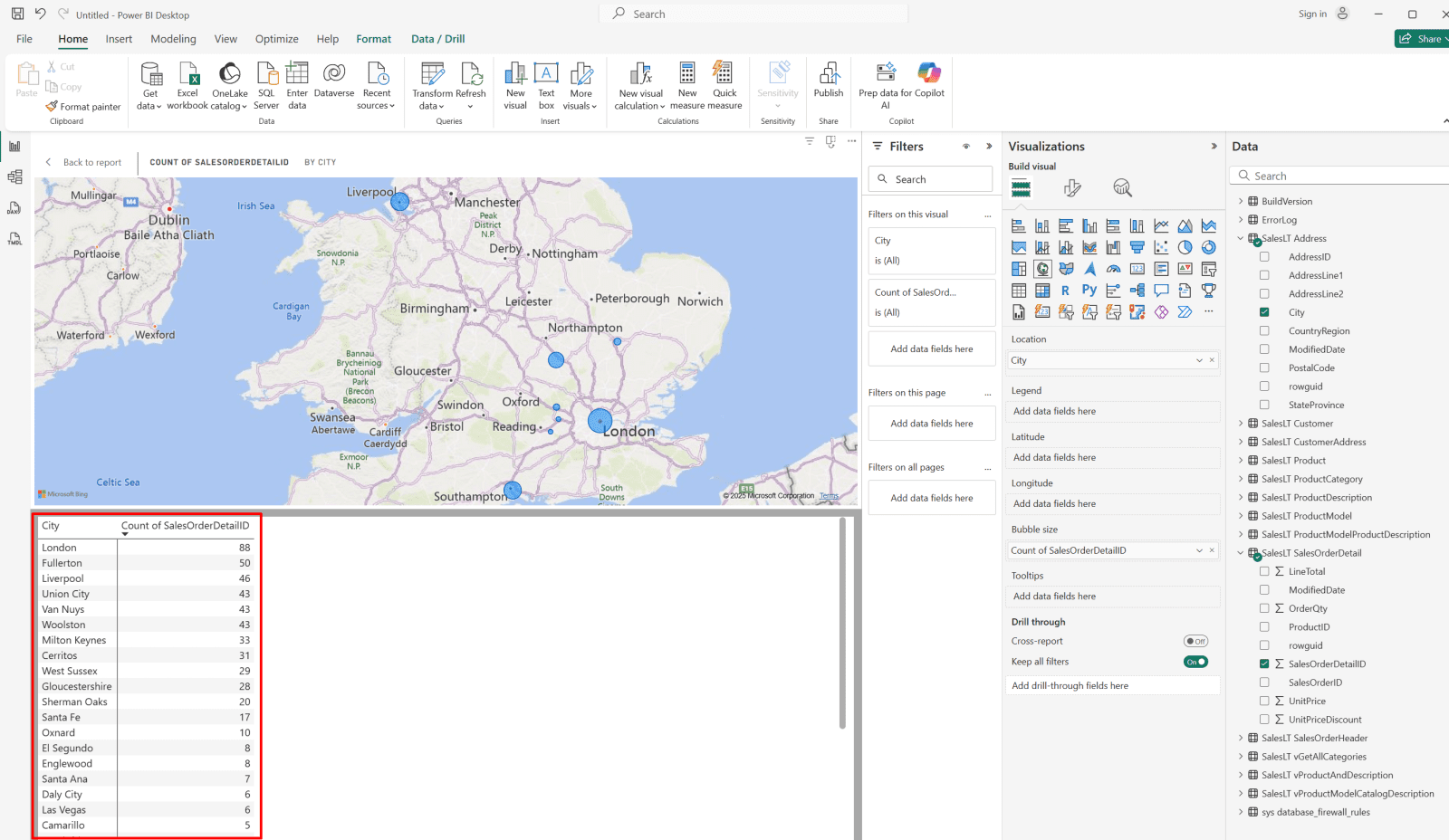
4. Start with counting how many cities exist in each country (from the SalesLT.Address table).

Drag and drop "City" under "Values"
Drag and drop "Countryregion" under "Legend"

So right now:

  • 295 (65.56%) → There are 295 city entries in the United States
  • 115 (25.56%) → 115 in Canada
  • 40 (8.89%) → 40 in the United Kingdom

These aren’t unique cities - it’s the number of address records that reference a city in that country.

*

5. Increase CountryRegion font size for better readability.

  • Select the “Format your visual” (paint roller) icon.
  • Go to Legend → Options.
  • Increase the font size and adjust the color for improved visibility.

*

6. Increase the font size of percentage labels for clarity.

  • Select the “Format your visual” (paint roller) icon.
  • In the Visual tab, go to Detail labels → Options.
  • Increase the font size and adjust the color for better readability.

*

7. Show Total Sales by Country

  • Insert a new Pie Chart.

In the Data pane, configure the following:

  • Values: SalesLT SalesOrderDetail → LineTotal → set aggregation to Sum.
  • Legend: SalesLT Customer → CountryRegion (if unavailable, join Customer → Address → CountryRegion)

The chart will now display the total sales amount per country, where each slice represents one country’s total sales volume.

Label the visual as “Total Sales by CountryRegion.”

*

8. Modify the title font and color.

  • Select “Format your visual” → General → Title.
  • Adjust the font size, style, and color as desired.

Note: Apply the same styling to each chart for a consistent visual design.

*

9. Add a shadow effect to each chart for better visual distinction.

  • Select the “Format your visual” (paint roller) icon.
  • In the General tab, open Effects.
  • Set Shadow to On.

Note: Apply this setting to each chart for a consistent appearance.

*

10. Identify Top Sellers

  • Drag and drop SalesPerson under Y-axis.
  • Drag and drop SalesOrderDetailID under X-axis.
  • Drag and drop CountryRegion under Legend.

Note: This configuration categorizes sales by the number of orders.

This clustered bar chart visualizes the top sellers by username, grouped by country. Each bar represents a salesperson, and its length indicates total sales performance.
In this sample dataset, Jae0 (United Kingdom) achieved the highest number of sales, followed by Linda3 and Shu0 from the United States.

*

11. Replace Count of SalesOrderDetailID with Sum of LineTotal (from SalesLT SalesOrderDetail).

This change measures the total sales amount ($) instead of the number of orders.

This clustered bar chart visualizes the top sellers by username, grouped by country. Each bar represents a salesperson, and its length reflects total sales performance.
In this sample dataset, Jae0 (United Kingdom) achieved the highest total sales, followed by Linda3 and Shu0 from the United States.

Visualize your SQL database using a Map in Power BI.

Use a Map in Power BI to visualize your SQL database and identify top-selling regions or countries with interactive, location-based insights.

Before using the map visual, ensure that the Microsoft.Insights resource provider is registered in the Azure portal:

  • Navigate to Subscriptions → Settings → Resource providers.
  • Search for Microsoft.Insights.
  • Confirm that its status is Registered (register it if not).

*

Visualize you SQL database

1. Go to SQL database → Power platform → Power BI → Get started

*

2. Click on created .pbids file

*

3. You will be redirected to Power BI Desktop.

After authenticating to the Azure portal with your credentials, open the Navigator and select the tables you want to visualize.

Note: Before connecting, ensure your client IP address is added to the SQL Server firewall:

Go to SQL Server → Networking → Add your client IPv4 address → Save.

*

In this demo I will choose them all.

*

4. On the right pane, choose map icon under visualization then the columns that you want to visualize (e.g. City)

As we can see, the Power BI map visualization successfully loaded and plotted the City field from your dataset.

*

5. Let's visualize where your most active sales regions are.

  • Choose "City" under SalesLT Address & SalesOrderDetailID under SalesLT SalesOrderDetail

The Map:

  • Each blue circle represents a city from your SalesLT Address table. (zoom in/out)
  • The size of each circle = Count of SalesOrderDetailID — meaning how many individual order line items came from customers in that city.
  • Larger circles = more sales activity.

*

6. Add a Table View

  • Right-click on the map visual and select “Show as a table.”

*

7. The table will list each city and the corresponding number of sales records (Count of SalesOrderDetailID).

Example:

  • London → 88 (highest sales activity)
  • Fullerton → 50
  • Liverpool → 46
  • Union City → 43

Note: This means London currently has the highest number of sales transactions in your dataset.

*

8. See which salesperson is dominant in each region by selecting SalesPerson under "SalesLT Costumers"

Table (Bottom):

  • Displays each City and breaks it down by SalesPerson.

For example:

  • London → handled by adventure-works\jae0
  • United States → adventure-works\linda3
  • Fullerton → handled by adventure-works\shu0, etc.

This means you are now visualizing which salesperson contributed to each city’s sales volume.

Note: Each salesperson is represented by a different color.

Connect Power BI to Azure Log Analytics using the Kusto connector.

Connect Power BI to Azure Log Analytics using the Kusto connector to query and visualize real-time security data, alerts, and trends directly within Power BI.

1. Open Power BI → Get Data → Azure → Azure Data Explorer (Kusto)

Select:

  • Azure → Azure Data Explorer (Kusto)
  • Click Connect.

Note: You can use a similar method to connect other available Azure resources to Power BI.

*

2. Enter Cluster URI.

For Log Analytics workspaces, you can use the shared Azure Monitor endpoint.

Use this URI format:

  • https://ade.loganalytics.io/subscriptions/<subscription-id>/resourcegroups/<resource-group-name>/providers/microsoft.operationalinsights/workspaces/<workspace-name>

*

3. Select Your Database and Table.

Expand it -  you’ll find tables like:

  • SecurityAlert
  • SecurityIncident
  • SecurityRecommendation
  • Heartbeat
  • SigninLogs

Select one (or multiple), or click Use Direct Query to write your own KQL.

  • Click "Load"

Note: In this demo I've selected all the above tables.

*

4. You should have the tables loaded to Power BI.

*

5. Choose the donut chart and expand the "Security alert" table.

*

6. To visualize, you need to drag and drop your values to the "Visualization" section.

  • Drag and drop "AlertName" under "Legend"
  • Drag and drop "AlertSeverity" under "Values"

*

7. Add Additional Fields to Tooltips

  • Drag a field such as ProviderName or StartTime into the Tooltips box under the “Build visual” section.
  • Additionally, drag and drop ProductName, ProviderName, and StartTime into Tooltip to display detailed information when hovering over data points.

*

8. Hover over any slice, and you’ll see richer contextual info for your readers.

*

9. Style and Label Your “Security Alerts” Donut Chart

Format the chart title for a professional appearance:

  • In the right panel, go to Visual → General → Title and expand it.
  • Rename the title to Security Alerts by Alert Name and Severity.
  • Set the font to Segoe UI or Arial, size 18, and weight Bold.
  • Align the title to Center and set the color to #0078D4 (Microsoft blue).

As shown, the title has now been successfully updated.

*

10. Enable and Customize Data Labels:

  • Increase the font size of your data labels for better readability.
  • In the Format Visual panel, scroll down to Detail labels and turn it ON (if it’s off).

Under Label contents, select:

  • Category (Alert Name)
  • Value (Count)
  • Percent of total

Change the Position to Outside End.

Set the font size to 16 for improved clarity.

*

11. Customize the Legend section and increase font size.

*

12. Apply Severity-Based Colors

In the same Format Visual panel, expand Slices.

You’ll see each alert or severity level listed (depending on your legend).

Manually apply the following color standards:

  • High: #D83B01
  • Medium: #FFB900
  • Low: #FFD966

Select each alert name and change its color according to the corresponding severity level.

*

13. Repeat the previous steps to assign the medium-level color (orange) to the “PowerShell Execution Rule.”

  • Select the PowerShell Execution Rule slice in the chart.
  • Apply the Medium severity color: #FFB900.

A clean, labeled donut chart showing alert categories and severities, with color-coded slices and clear percentages - visually summarizing Defender for Cloud detections.

*

Conclusion

This project demonstrates how Power BI can be integrated with both SQL databases and Azure Log Analytics to deliver comprehensive business and security insights. By visualizing sales performance through Pie and Map charts and monitoring security alerts via the Kusto connector with a Donut chart, you create an interactive, data-driven view of organizational performance and threat posture. These techniques highlight Power BI’s flexibility for both business intelligence and cloud security analytics using real-world Azure data sources.

*

Written by Kirill.A - Azure & Cybersecurity Consultant at AntusNet

➤ Want more? Browse all our Azure implementation guides.

Need help implementing secure Azure solutions?

Contact us for a free consultation.

    error: Content is protected !!